The typeface Guia by Tânia Raposo has been her final project at the type]media Master in The Hague. “Guia” is the Portuguese word for “Guide”. In this guest article on opentype.info, Tânia explains the development of her typeface. Tweet
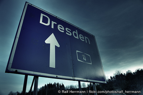
Tag Archives: featured
Wayfinding observations: Separation slows down perception
Wayfinding signs can have various shapes and layouts. For example, German road signs fall in one of those four categories: The amount of separation increased on these sign types. On the first sign, all targets are presented together, on the last sign, every target has its own sign. But which one is most effective? On […]
Wayfinding observations: Landmarks and cardinal directions
When we come to a new city we build a cognitve map to represent this city in our minds. Unless you have photographic memory such cognitve maps work differently from topographic maps. They don’t consist of exact representations and distances, but are driven by landmarks and the paths that connect them. A landmark can be […]
Designing the ultimate wayfinding typeface
Over the last couple of years I have researched the design and use of typefaces used for signage, especially road signage. Tweet
Traffic Sign Typefaces: DIN 1451 (Germany)
The official traffic typeface in Germany is called DIN 1451 and has a very long history … Tweet
Myths about Helvetica and Mac OS X (since 10.5)
For many years professional graphic designers are used to replace the Helvetica system fonts on the Mac OS with a Type1 version. But with Leopard this seems to be impossible. Whenever you delete the fonts, they will be reinstalled after you reboot the system and you will get a lot of annoying font conflicts. I […]