 Follow me on Twitter:
Archive by Author
Typographunnies
Posted on 27. Aug, 2008 by Ralf Herrmann.
 Did you hear? Comma and Period got married.
Really? Comma’s a great guy, but who’s Period?
Some moody chick he picked up at the Crossbar a year ago.
I bet she’s perfect for him.
Yep, she’s always finishing his sentences.
This website collects typographic jokes.You can submit your own and rate the presented jokes.
via TypoForum
Continue Reading
10 Great Free Fonts for @font-face embedding
Posted on 05. Aug, 2008 by Ralf Herrmann.
Safari and Internet Explorer already support it*. Firefox and Opera will get it soon: Downloadable webfonts. Here is a collection of 10 great headline fonts you can embed in you website free of charge …
Continue Reading
Comic Sans saves the font world
Posted on 22. Jul, 2008 by Ralf Herrmann.
via Typophile
Continue Reading
Traffic Sign Typefaces: Poland
Posted on 08. Jul, 2008 by Ralf Herrmann.
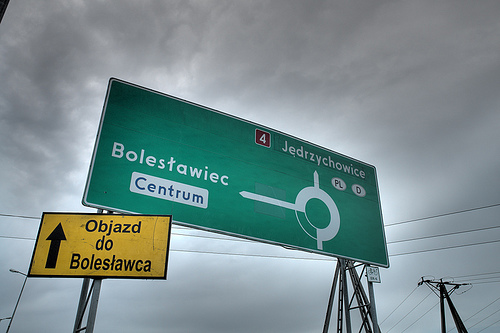
When I first saw a digital version of the Polish traffic typeface, I though I must have gotten a really bad digitization. It had characters which were obviously cut off by mistake …
Continue Reading
Webfonts.info
Posted on 19. Jun, 2008 by Ralf Herrmann.

Yes, I do love .info domains. After typografie.info, fonts.info and opentype.info here is a new project: webfonts.info. A place to bring the people together, who are involved or interested in downloadable webfonts. The site has a forum for discussions and a Wiki with a generous Creative Commons license to collect information, links and code samples.
Continue Reading
Kerning and OpenType features in Firefox 3
Posted on 14. Jun, 2008 by Ralf Herrmann.
Firefox 3 will be the first major browser with support for kerning and automatic ligatures. I tested the Firefox 3 release canditate and I have to say, it’s not perfect yet. But first the good news:
Kerning
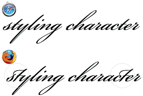
Kerning is an important feature in print typography but for most of the (rather small) texts we read on the screen it is no big deal. But for larger headlines and print-outs it’s really nice to have support for kerning. See this comparison between Safari 3 and Firefox 3:
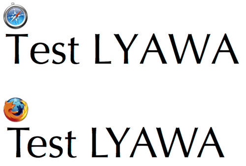
The Webkit developers claimed they have turned off kerning to avoid performance issues. But Firefox proves it can work.
Layout Features
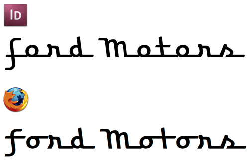
Firefox 3 supports a few layout features of fonts with OpenType or AAT (Apple Advanced Typography) tables. The most obvious one is basic ligatures. In this example you can see the typical f-ligatures that are common in latin fonts and are now used by default in Firefox 3, if the font supports this feature.
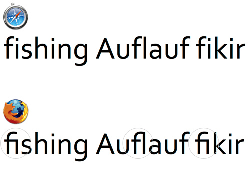
This is nice for webpages in English, but it doesn’t work in all languages. For example, in German the use of ligatures depends on the words. “Auflauf” is a word where a ligature is wrong. In Turkish such ligatures are not used at all because they would lead to confusion between the characters “i” and “dotless i”. The logic for dealing with those exceptions is usually built into the OpenType fonts, but Firefox doesn’t honor them.
Discretionary ligatures are optional ligatures. The application should turn them off by default and the user might activate them for setting a fancy headline. Unfortunately, Firefox has turned them on by default and this could really mess up the body copy of websites.
But it gets worse: Firefox 3 also applies ligatures that are only valid in a special context, for example the end of a word.
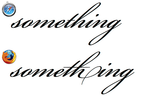
Firefox doesn’t seem to check for context-dependent replacements. Which is a great pity, because this is the real power of OpenType layout features. See this next example:
A script font like that relies heavily on contextual replacements. Without support for Contextual Alternates and Contextual Ligatures such a font is almost useless. Most standard system fonts may not require such OpenType features, but when downloadable webfonts will someday be available in Firefox those features will hopefully be supported.
The kerning support will hopefully set an example. But the current use of OpenType features in Firefox 3 is rather disappointing. When ligatures are thrown in that are wrong in the used context or language, I would rather see no ligatures at all.
Continue Reading
OpenType support in Flash Player 10
Posted on 05. Jun, 2008 by Ralf Herrmann.
 I had mixed emotions when Adobe announced to swallow Macromedia. But it was also obvious that this would someday lead to better text support in applications like Flash. With the Flash Player 10 this becomes finally reality. Flash Player 10 will support a large number of languages (including right-to-left and top-to-bottom writing systems) and many OpenType layout features, such as (discretionary) ligatures, contextual alternates, positional forms and different figure sets (proportional and tabular oldstyle figures/ proportional and tabular lining figures). See Thomas Phinney’s weblog for a detailed description.
You might also want to check out this YouTube video with a live demo of the new text layout features.
Continue Reading
Join the LTypI now!
Posted on 05. Jun, 2008 by Ralf Herrmann.
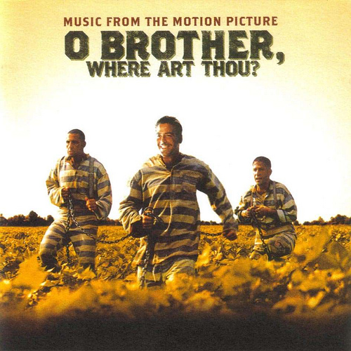
Which typeface could I use for the movie “O Brother, Where Art Thou?” Maybe Emigre’s Brothers?
Designing a logo for the “Hotel Broadway”? Let’s try the font Broadway!
Yes, that’s certainly a “Lack of typographic Imagination”! Stephen Coles (typographica.org) and Ivo Gabrowitsch (fontwerk.com) created the Flickr group LTypI to collect these hilarious font choices.
Continue Reading
Traffic Sign Typefaces: DIN 1451 (Germany)
Posted on 18. Mai, 2008 by Ralf Herrmann.
The official traffic typeface in Germany is called DIN 1451 and has a very long history …
Continue Reading
Exploring webfont possibilities
Posted on 14. Mai, 2008 by Ralf Herrmann.
Embeddable webfonts (as introduced with Safari 3.1) are not just about using fancy fonts on web pages. It also opens new possibilities for using glyphs that are simply not available in the standard system fonts. Let’s say you are a linguist or archeologist and wan’t to set an ancient text and you need characters that are not available in Arial or Lucida Grande. Putting little images inside the text was the only way to do it – so far. But the images wouln’t scale and copy & paste of such a text wouldn’t work properly. But with webfonts you could do those things smoothly – and much more. Here are two examples …