Interview with Frantisek Storm
Posted on 15. Nov, 2008 by Ralf Herrmann in Fonts, Typography

An interview with František Štorm, type designer and founder of the Storm Type Foundry in Prague:
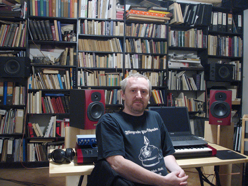
What are you reading at the moment?
I’m reading texts of my students, besides that I have to read books when designing them, I read lots of czech fiction literature. I’ve so may books so I move them slowly to my cottage from my Prague’s studio in believe that I’ll read them quietly in future far from civilization and stress. I love to red alone, among woods and ponds. Authors: Jaroslav Hasek, Jan Kresadlo, A. Schopenhauer, R. Feynmann, D. H. Thoreau, and yes, I read some poetry, too.
How do you proceed when you design a typeface?
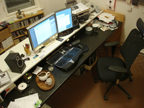
I shouldn’t say it among students, but I don’t begin with handdrawing, my computer is my sketchbook. Recently I bought second-hand Psion Revo with Sketch application which produces funny rough pixel images made with pen on touchscreen. But seriously, everything starts with specific order or insufficiency. If I need some typeface for my layout, I simply design it.
Where do you find inspiration for your type design?
In history and in individual experiment. first I need to know the roots, than I need to express myself.
How do you find the names for you fonts?
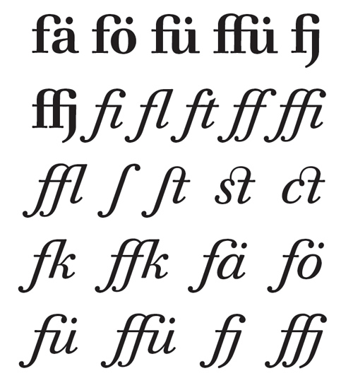
It’s getting harder, many good names are already occupied in the industry, I xperienced twice an unwanted collision so I had to change my naming. I ssume a good name of font should always reflect something from the soul or atmosphere, the story behind specific type. Sometimes it is just the name of inspiration source, “Walbaum” for example – obvious and simple. My “Sebastian” is different cause – it shares my personal crisis in 2002-3, I expressed my pain with type…
The 20th century has seen many stylistic changes in type design. Do you currently see a trend for the new century?
New century is a clichee expression and so is the scene in graphic design. Fashinable, boring, aggresive and, above all, copying and borrowing already roven methods. I believe in “less is more”, and – graphic design is not everything.
As I’m getting older, I ask for the subject, the meaning of designed thing. There are many interesting innovative styles in non-commercial area of type design, I believe in generation of my students, they can bring refreshing ideas based on a broad social dialogue, not narrowly focused on design only.
Nowadays digital type designs can spread around the world in seconds. Do you think local styles of type design will become more or less important in this time of globalization?
In terms of availability of fonts, small foundries are more flexible than big ones. You won’t see anything new from big companies (you know them) except for merging libraries and confusing users. Local designers can sway the global scene more effectively than ever before. That’s what Erik Spiekermann said many years ago, and nowadays it becomes true forever.
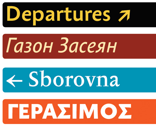
In my country, many clients believe in strong identity through logo and its repeated exposition. I advise them rather to show their products and ideas with the use of original font adjusted for their purposes. It can carry the identity by verbal interaction instead of “building an image” which may be unfaithful.
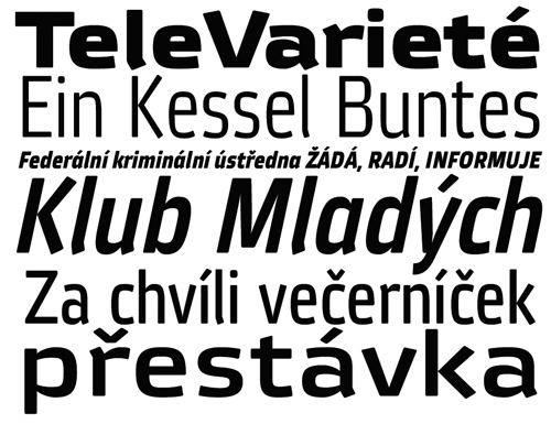
For more information see: http://www.stormtype.com/

 Follow me on Twitter:
johno
15. Nov, 2008
Great interview.
Love the line,
If I need some typeface for my layout, I simply design it.
A truly talented type designer, and I wish I were one of his students.
Mitternacht
17. Nov, 2008
Thank you very much for this very interesting interview. I recently discovered Storm Foundry and I really like their work (I love Banhauf). It’s great to have such a designer sharing his thoughts.