Traffic Sign Typefaces: Trafikkalfabetet (Norway)
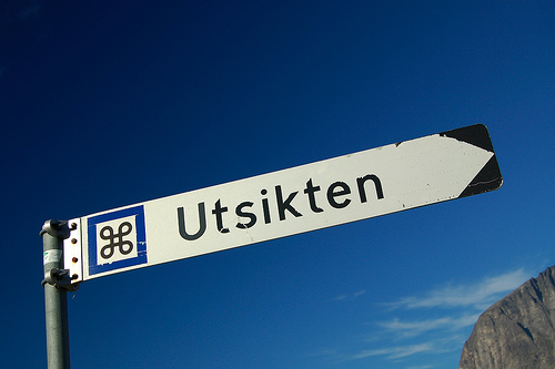
The typeface on the traffic signs of Norway is called Trafikkalfabetet and was designed in 1965 by Karl Petter Sandbæk.
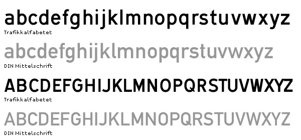
It bears a resemblance to the German DIN typeface, but it also has some unique features, some of them are good, some are bad.
Both typefaces share a very simple geometric design and they are good examples of typefaces, that look like they were made on the drawing-board of an engineer rather than designed by a type designer. Look at these letters from Trafikkalfabetet:
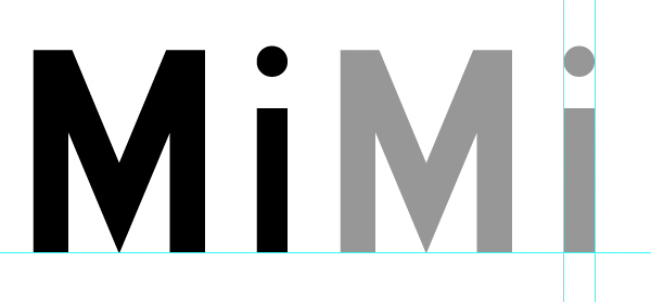
A type designers knows how to optically adjust geometrical shapes to make them look right. The tip of the M needs to go below the baseline and the dot of the »i« needs to be wider than the stem. But the design of the Trafikkalfabetet typeface rather aims at consistent values. As a result, the dot of the »i« is way too small, especially for a typeface that should be legible at great distance.
The spacing of the typeface has the similar problems. Uniform values for left and right sidebearings cannot create uniform spacing.
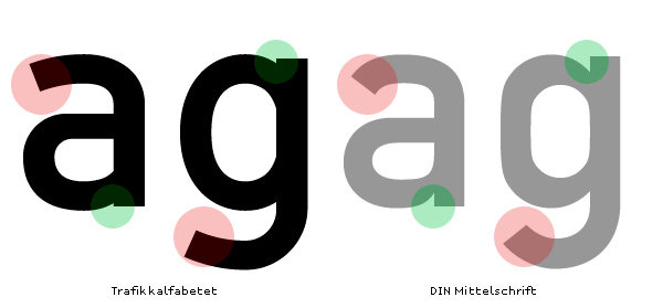
The counters of Trafikkalfabetet are more open (red circles) and the oval shapes are emphasized (compared to DIN). But on the other hand, important details are better executed in DIN than in the Trafikkalfabetet typeface (green circles).
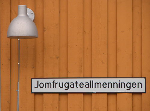
Trafikkalfabetet has only one style. So for longer pieces of information you can only make the type smaller or the sign longer.
A digitized version by Jacob Øvergaard is available at FontShop. It is perfectly executed but unfortunately it only has a limited characted set (a–z, A–Z, lining figures, brackets and å, ø,æ ,Å, Ø,Æ).
No comments yet.