Traffic Sign Typefaces: France
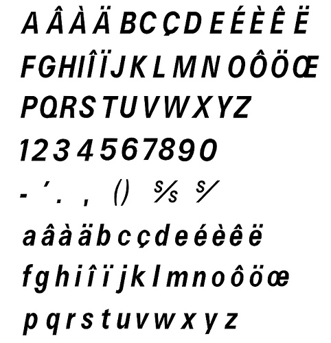
In France four fonts are currently used. The main fonts are called L1 and L2.
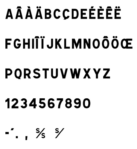
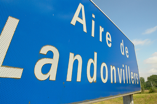
L1 and L2 are caps-only alphabets. L1 is set in black letters on white background and is used for local targets.
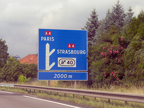
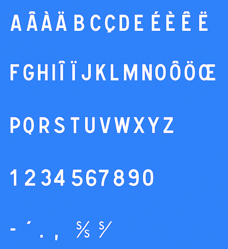
L2 is set in white on blue (Autoroutes) or green (Routes Nationales) background and is used for distant targets. L1 and L2 are basically the same design, but L2 is lighter and set with increased spacing to compensate for the overglow effect of white letters.
The design of L1 and L2 are neither very good nor very bad. It’s a typical semi-geometric design similar to the traffic typefaces used in other European countries. A unique feature are the large counters of P and R. In general it is a good idea to have large counters for a typeface used for traffic signs, but a letter is also recognized by the white-space around it, so they might have overdone it a litte bit. Another problem might be the descenders of Q and Ç, which are designed not prominent enough.
For local target and public facilities the italic font L4 is used. The uppercase letters are similar to the L2 fonts and the lowercase letters bear resemblance to Frutiger’s Univers typeface.
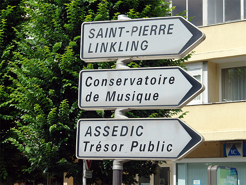
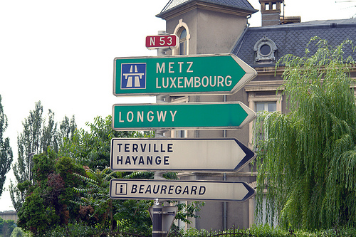
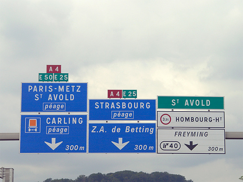
In theory it sounds like a good idea to use different type styles to mark different kinds of targets, but when I look at the different styles and sizes in this image, the result looks rather confusing:
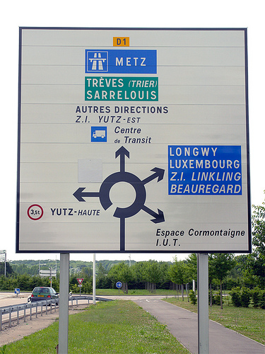
The same is true for the overall design of the signs on which the content looks very scattered. The color coding works fine, but the separated signs and the type treatments don’t give me any clues about a clear hierarchy of the presented information:
An additional font is the L5 alphabet. It seems to be derived from Frutiger and is apparently used for signs of less importance, for example the ones pointing to local points of interest.
A freeware version of L1, L2 and L4 is called Caracteres and can be downloaded from here. URW++ offers a commercial digitization called Signal.
- Other traffic typeface articles
- Flickr pool Type on Traffic Signs
Do you know what does “s/s” stand for?
sur seine?!
I agree, the sign with all the different styles on it is quite confusing. Thanks for sharing! =)
I like the usage of the different weights, quite complicate to read as driver, but the complete look is good
Klasse, thanks!
Thanks for putting up this useful information.
Also, s/ means “sur” (on) and s/s means “sous” (below)