Walbaum Type Specimen in high resolution
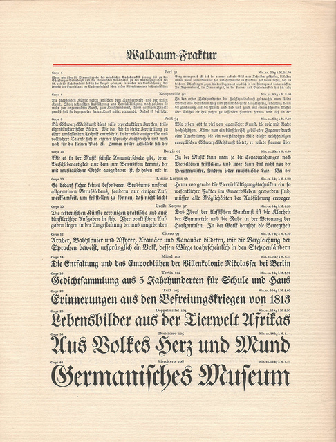
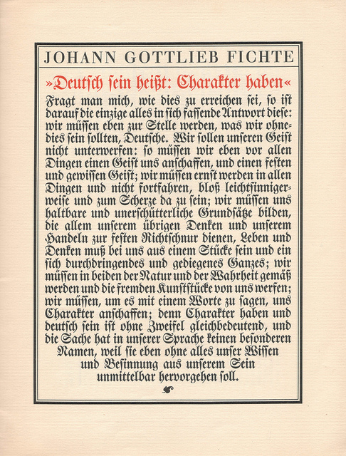
The type designer Justus Erich Walbaum was born in 1768 and started his career in a spice shop. His skill of making baking pans lead him to engrave steel plates for printing music books and later he started to cut letters. Around 1800 he designed the serif typeface Walbaum Antiqua and the corresponding italics (Walbaum Kursiv) as well as a blackletter typeface (Walbaum Fraktur). At the beginning of the 19th century he moved to Weimar, Germany after being invited by Karl August, Grand Duke of Saxe-Weimar-Eisenach. Weimar had become a center of German neoclassicism and attracted writers and publishers.
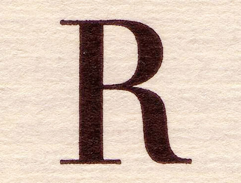
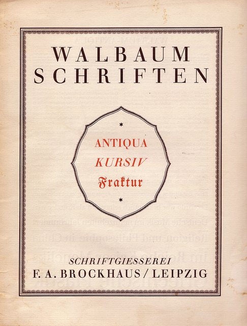
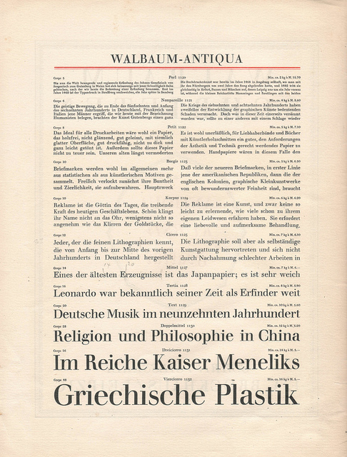
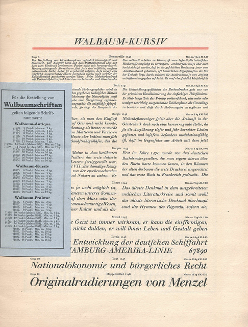
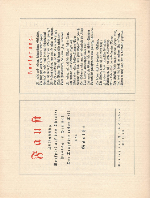
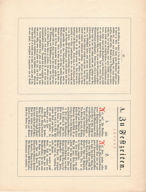
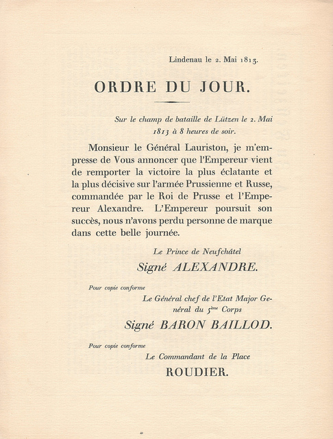
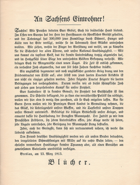
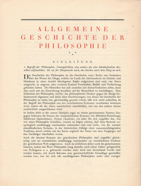
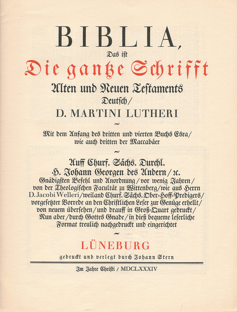
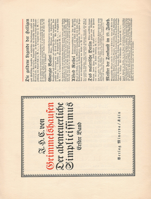
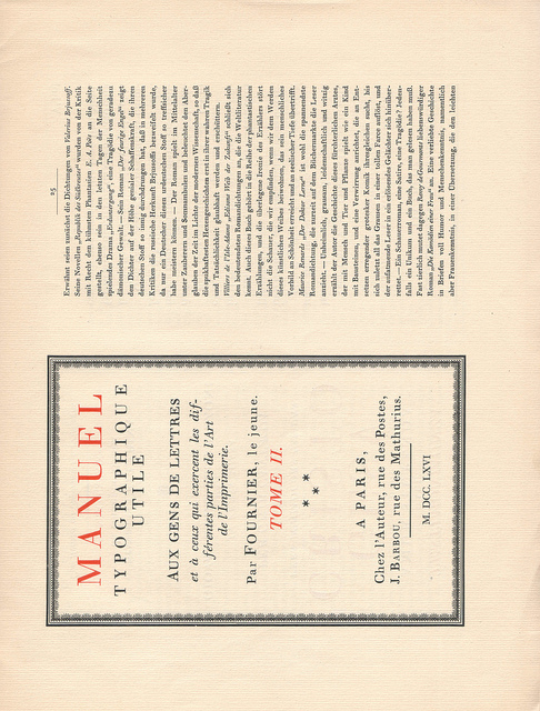
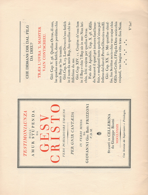
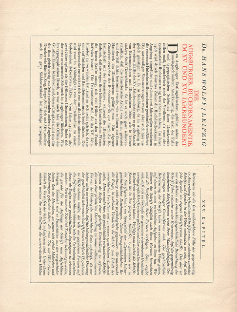
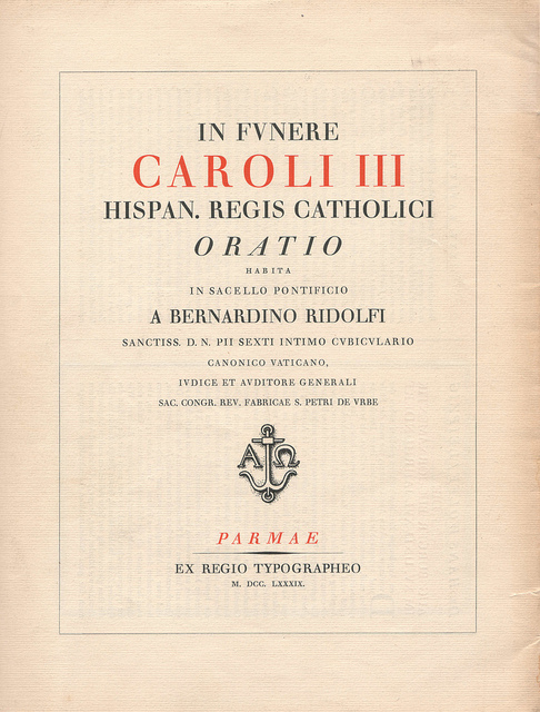
Walbaum Antiqua became one of the most successful Didone typefaces beside Bodoni and Didot. Below is a scan of the Walbaum type specimen by F.A. Brockhaus, Leipzig. The links will take you to my Flickr account where the hi-res version are available with a size of 4960 x 6528 Pixels (that’s 600dpi)! The image above shows a close-up of the scans.
Thank you very much for putting up the specimen on flickr! It is marvellous to see the elegance of Walbaum Antiqua in crisp and clear images.
Danke, Ralf! Ich arbeite grad an einem modernen Specimen für die Walbaum und für meine Recherchen kann ich Deine Bilder sehr gut gebrauchen!