Hooptie Script—Two Typefaces inspired by the Motor City
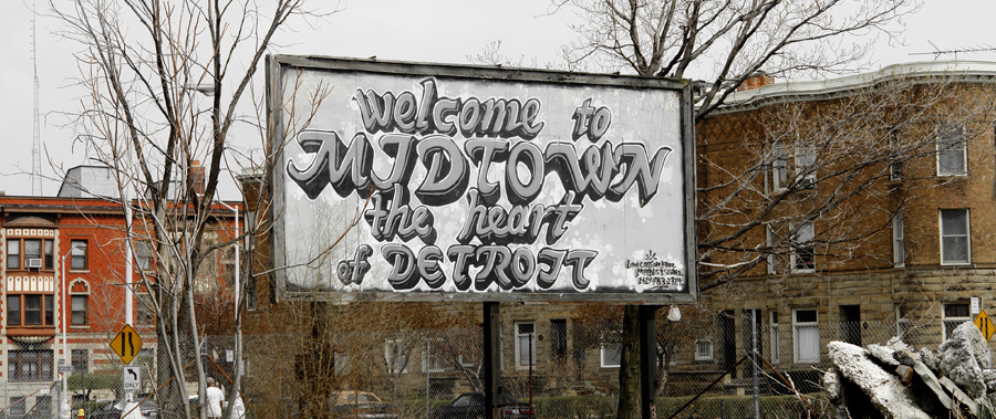
Detroit—a city of extremes. A third of the city lies derelict, and many buildings have been or are about to be torn down. But at the beginning of the 20th century Detroit was one of the boomtowns of North America, representing the birthplace and the center of the American car industry.
The city’s wealth was reflected in the design of the automobiles. Never before were they as big and extravagant as in the middle of the 20th century. Car manufacturers like Cadillac fitted their cars with shiny chrome parts and developed a new kind of type design: Chrome Script. Since the heavy emblems were to be made out of a single piece of metal, new types of script fonts were created. They quickly became an iconic design element of the time, and began to appear on other products like record players, vacuum cleaners and refrigerators.

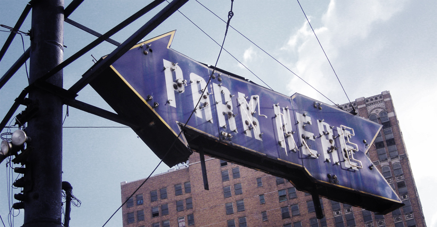
In 2006, together with Franziska Jähnke and Dörte Wächter—two friends of mine who also graduated from the Bauhaus University Weimar—I spent several months in Detroit. We explored the abandoned automobile plants and learned about Detroit’s unique history, its impact on the world and its rise and fall during the course of the 20th century.
The Typefaces
The first new English word we learned in Detroit was “hooptie”—the slang term for a worn-out car. And this term followed us wherever we went, because very old cars are still everywhere in Detroit. It didn’t take long until I fell in love with the beautiful script type that was used on these cars …
Based on this style, we later developed a new OpenType font family called “Hooptie Script”, which is directly inspired by Detroit’s car lettering of the 1940s and 1950s. One style is directly based on an emblem of a Pontiac Star Chief model and the other one is loosely based on an emblem of a Packard Clipper, which we found close to the now abandoned Packard plant—once considered the most modern automobile manufacturing facility in the world.
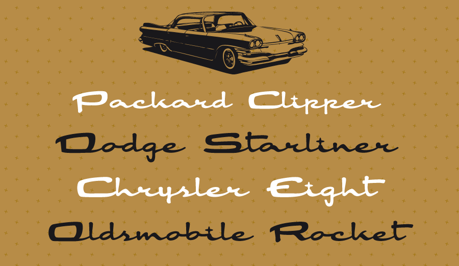
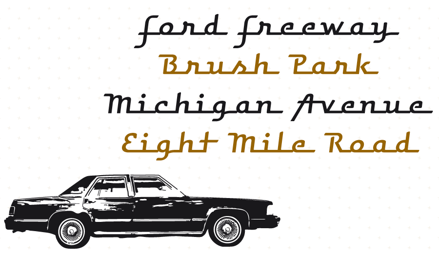
Retro script fonts like these always have one problem: When the lettering artists designed the actual car emblems they knew which letters would appear in the name of the car maker or the model. But once you turn such a beautiful design into a font, there will always be an endless number of possible letter pairs, which don’t connect properly. When the “e” has a final stroke at the x-height it will connect perfectly to an “f”, but it will not work at all, when it is followed by an “s”. And these problems cannot even be fixed by creating a large set of ligatures, because each ligature itself then needs a perfect connection to the preceding and subsequent letters. In the Hooptie Script typeface this is solved by the use of contextual alternates, which can be set automatically in OpenType-savvy applications.

Whenever you type a letter, the connection between this letter and the preceding letter is checked and if necessary, the preceding letter is automatically changed to an alternative version. And this works all the time! You can even make the words longer by adding an underscore character between the letters—and again, the letters will automatically adapt if necessary.

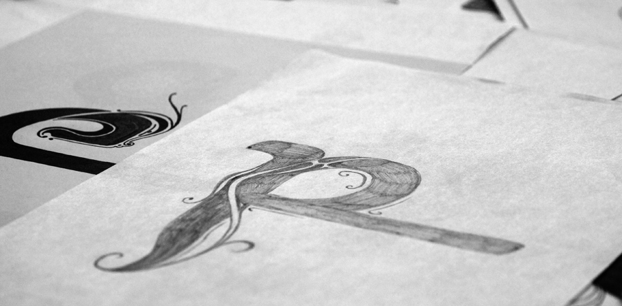
There is also a swash style which contain some hand-drawn letters like these.
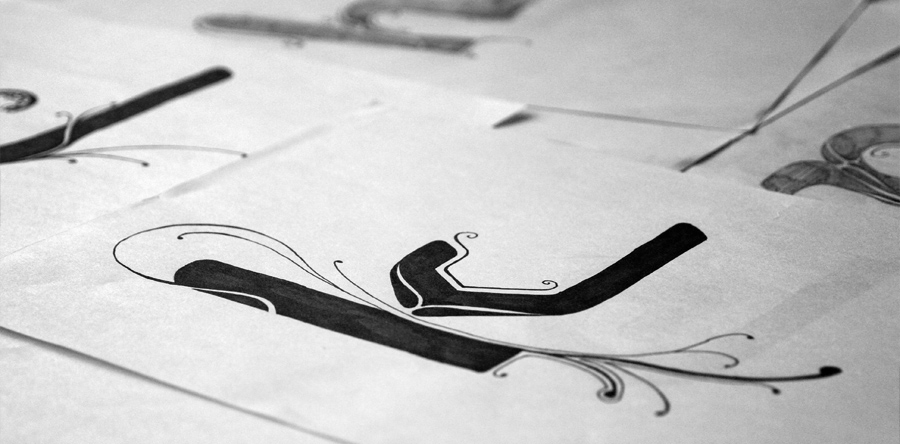
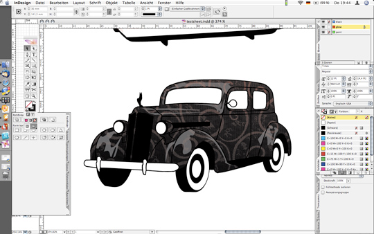
To see more of the typefaces, have a look at the PDF type specimen. The fonts are available for licensing at fonts.info and MyFonts. Until November 15th all fonts and packages of Hooptie Script are 30% off. If you purchase the complete set, you even get some bonus vector images of Detroit cars.
The Motor City Book
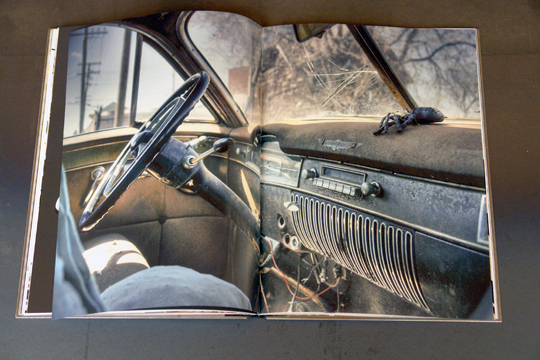
But we weren’t just fascinated by the car lettering of Detroit, but also by the city itself. So even back in Detroit, we decided that we would not only create these typefaces, but also a (type specimen) book to tell the incredible story of Detroit and its famous people like Cadillac, Pontiac, Chevrolet, Ford and many others to the people here in Europe.
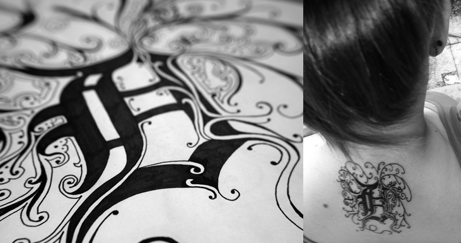
The typefaces and the book were created together and influenced each other. For example, the style of this drawing for the book, was later used to create the swash letters of Hooptie Script. And some people in Detroit, who have seen it on Flickr, have even used it as a tattoo!
A shortened version can now be viewed online and in fullscreen mode. The copy texts are currently only available in German, but you might still enjoy flipping through these pages …
http://www.hooptie.de.
No comments yet.