The Capital Sharp S of the German Government
Next week, it will be exactly four years since the Capital Sharp S was added to the Unicode specification. Within that rather short period of time, it …
- has been added to over 170 new type families
- included in the main typefaces of the world’s most used PC operating system Windows and office suite
- recommended as standard spelling by governmental bodies (for example for geographical names)
- adopted and used by many individual users, newspapers (such as Gießener Zeitung), institutions (like the Bauhaus University in Weimar) and so on
- and now even the public relation office of the German government specifically asked for the inclusion of this character in the new corporate typefaces of the German government called BundesSans and BundesSerif.
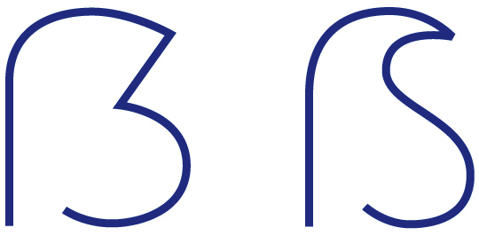
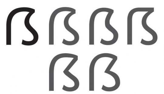
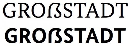
Martin Wenzel and Jürgen Huber called their design Zehlendorfer Form, named after the district in Berlin where their office is located. The design feels like it falls right between the usual Dresdner Form and Leipziger Form. In an interview they explained, they chose this design, because it can easily be written and fits in with the other capital letters. They also mentioned, that is is important that the Capital Sharp S is drawn as a wide character, so it will get the appearance of a capital letter in contrast to the lowercase ß.
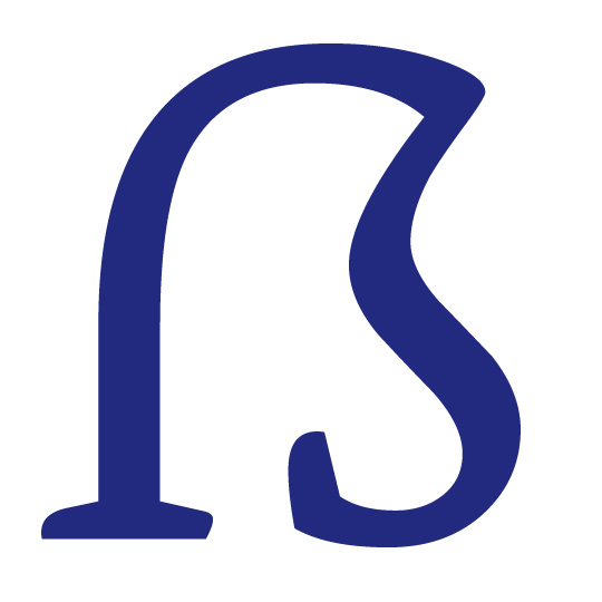
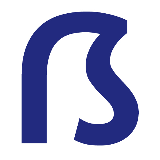
So there you have it: An interesting new design principle for the Capital Sharp S. From my point of view, it works very well, especially since it cannot be mistaken for a B.
As always, a really interesting article Ralf, many thanks.
The one question I have is how could it possibly have taken so long for such a common glyph (found on almost every german language street sign) to become part of Unicode?
Just the uppercase version had no Unicode because it was never part of official orthography. I explained the historical details here: http://opentype.info/blog/2011/01/24/capital-sharp-s/
Ralf, I take great pleasure in reading your articles on the scharfes S. This one is no exception. “Zehlendorfer Form” … I love it! It is terrific to finally see the German alphabet being more widely adopted on computer systems. If only I could convince my country (Australia) of being more typographically open-minded.
I rather like the Zehlendorfer Form. Well done, Martin and Jürgen!
Exactly what I hope the character to look like. I like the Zehlendorfer form!