The Capital Sharp S in Use
A while ago I announced on Twitter, that it is now 5 years since the Capital Sharp S was added to the Unicode. I was asked, if it has actually been used somewhere in real world situations. A valid question! A new character shouldn’t just be made to look good in type specimen brochures. So in this article I am presenting uses of the Capital Sharp S which I know of. I left out examples which are more than 5 years old and also all cases, where the the Capital Sharp S is just used to demonstrate the character itself, e.g. in recent typography books and type specimen PDFs.
Keep in mind: The Capital Sharp S is not an official part of German orthography yet and keyboards with built-in support for it have just started to ship last year. There is also no immediate need to have this character available, as with the introduction of new currency signs. So the Capital Sharp S needs to become the norm by more and more people using it and for that, their favorite typefaces need to have support for that character. So it’s natural, that this process takes some time. But considering this, I am actually quite pleased how many uses I could already collect.
Corporate Font Example 1: RWE Energy Company
RWE is one of Germany’s major electric utilities companies with millions of customers. They have their own corporate font and the corporate design requires all headlines to be set in caps only—a typical need for the Capital Sharp S.
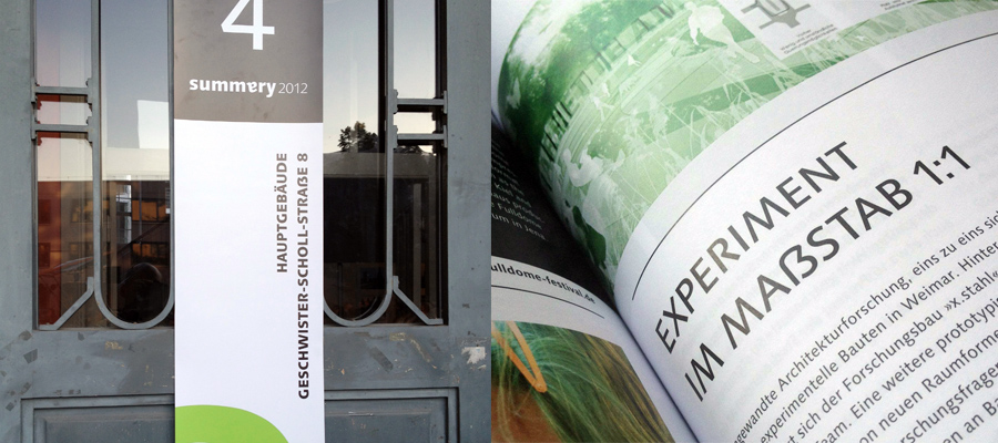
Corporate Font Example 2: Bauhaus University, Weimar
A similar example is the Bauhaus University in Weimar. They too, use a lot of caps, mostly for headlines. So they commissioned a Capital Sharp S for their corporate font (Linotype Syntax) and use it quite extensively.
Capital Sharp S use in a flyer of the Bauhaus University. It makes a lot of sense. “Bauhausstraße” would otherwise be set as BAUHAUSSTRASSE, which would suggest a different pronounciation, because “ss” and “ß” nowadays represent a different length of the vowel in front of those characters. In addition, Karl Haußknecht is a name. Using a Capital Sharp S is the only way to set this name in an unambiguous way in caps.

Miscellaneous Uses
The TV station Deluxe Music is using caps for all headlines — a Capital Sharps S helps
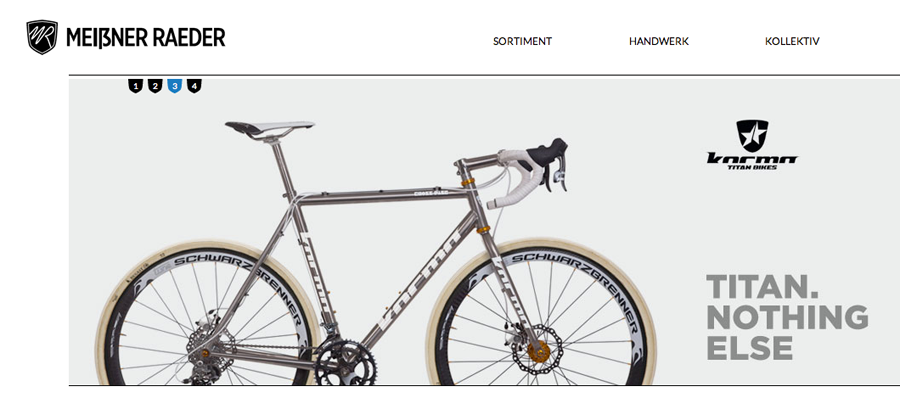
Logo for a bike shop in the city of Dresden.
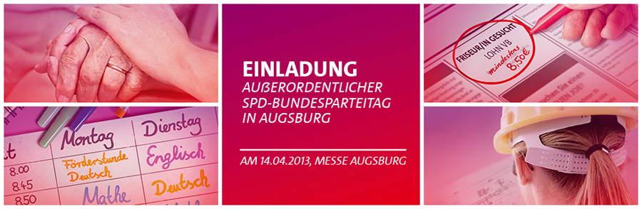
An announcement on the homepage of SPD, one of the two major political parties in Germany.
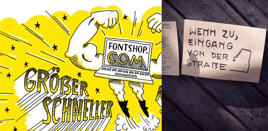
Drawn and written. Homepage of FontShop (left) and a written note with a Capital Sharp S(right).
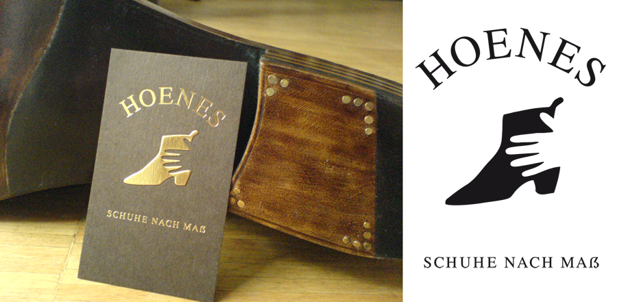
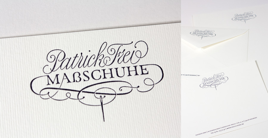
Logo of a shoemaker. (Design: deea.net)
And another shoemaker. (Design: Tobias-David Albert)
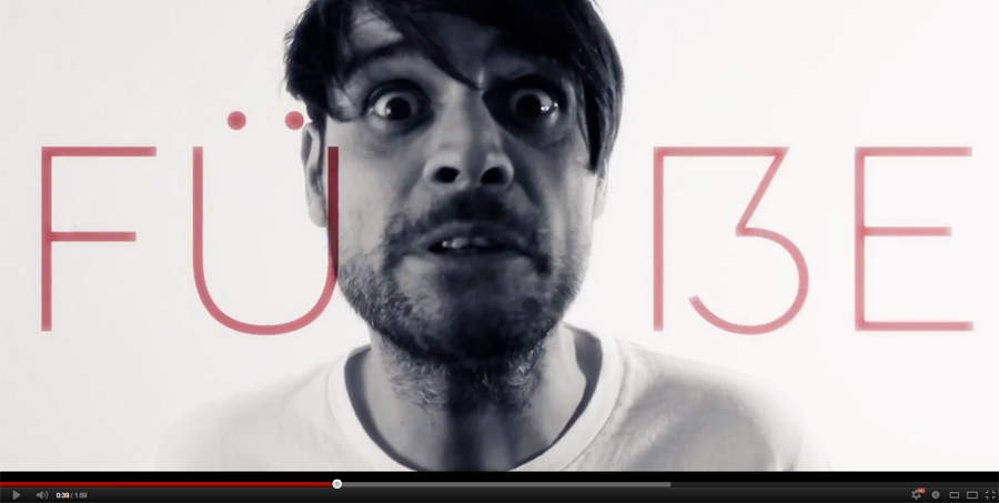
A video from the band Love A.

Logo of the newspaper Gießener Zeitung
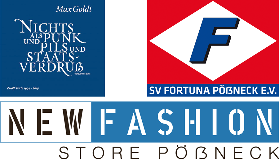
A CD cover and two logos used in the German town Pößneck
A custom Capital Sharp S drawn for a book use by Nina Stössinger for the Newzald typeface
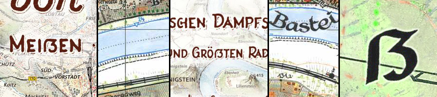
From the hiking maps of Dr.-Ing. Rolf Böhm
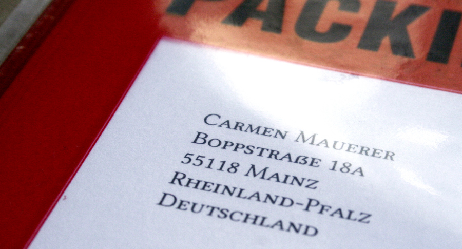
The paper-manufacturing company Gmund uses a Capital Sharp S for its packing slips.
You know other examples? Let me know and I will add them to this article!
If you want to learn more about the Capital Sharp S, feel free to check out my other articles on this subject.
Bei aller Deiner Begeisterung, ist da bei Patrick Frei nicht ein ganz gewöhnliches Eszett durchgerutscht?
Oder ist meine Skepsis bezüglich der Unterscheidbarkeit nur bestätigt?
>>ein ganz gewöhnliches Eszett durchgerutscht?
Nein. Es ist ein manueller Entwurf speziell für diese Wortmarke. Da »rutscht« nichts durch.
>>Oder ist meine Skepsis bezüglich der Unterscheidbarkeit nur bestätigt?
In wieweit ß und ẞ unterscheiden, ist nicht relevant, sondern nur, wie sie im jeweiligen Kontext funktionieren.
Aha, I recently noticed a capital sharp S on an SPD campaign poster near Oranienburg. I assumed it was used only because it appeared in the candidate’s name, but it seems, from the example you posted, that they are using it more generally as well.