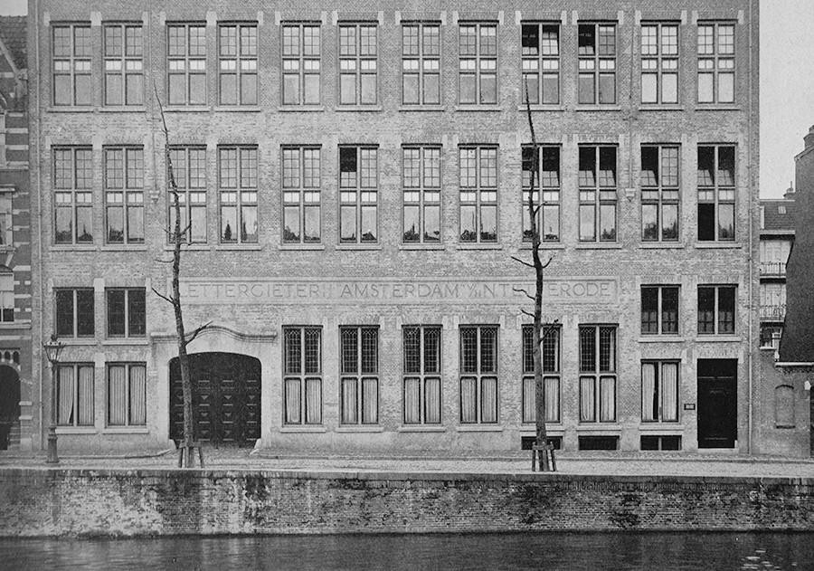
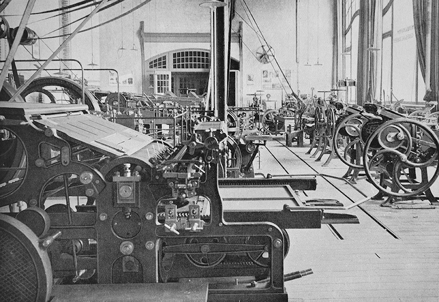
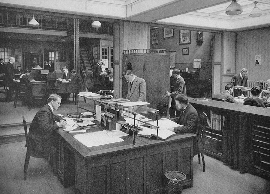
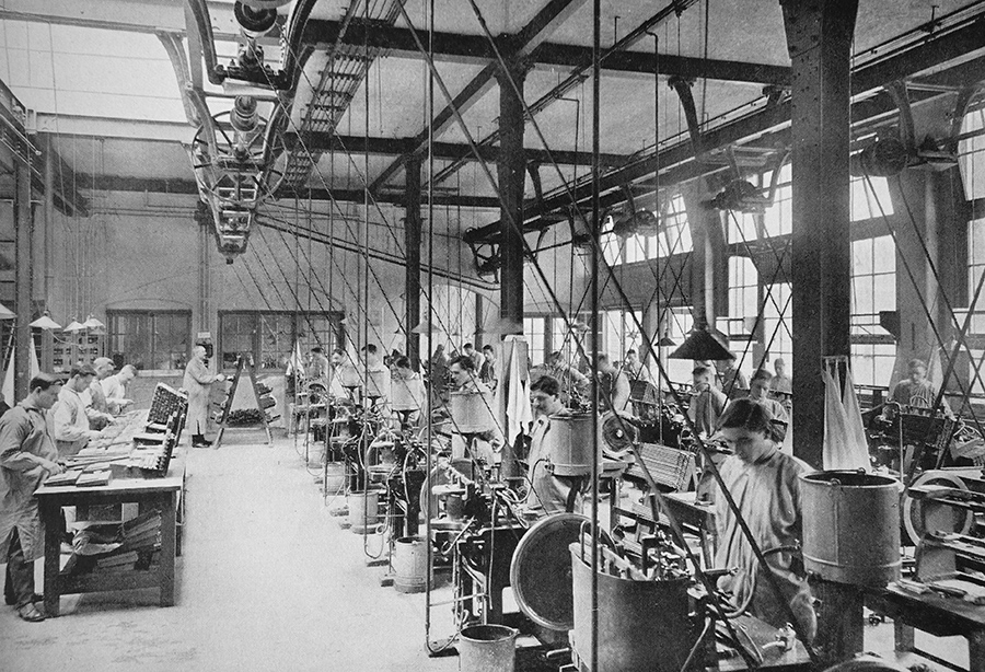
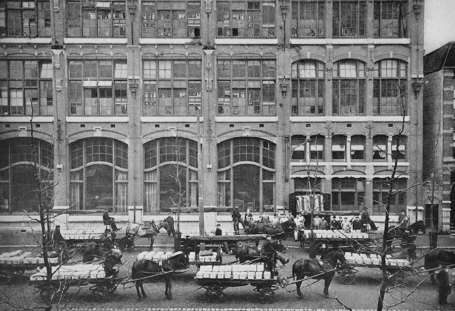
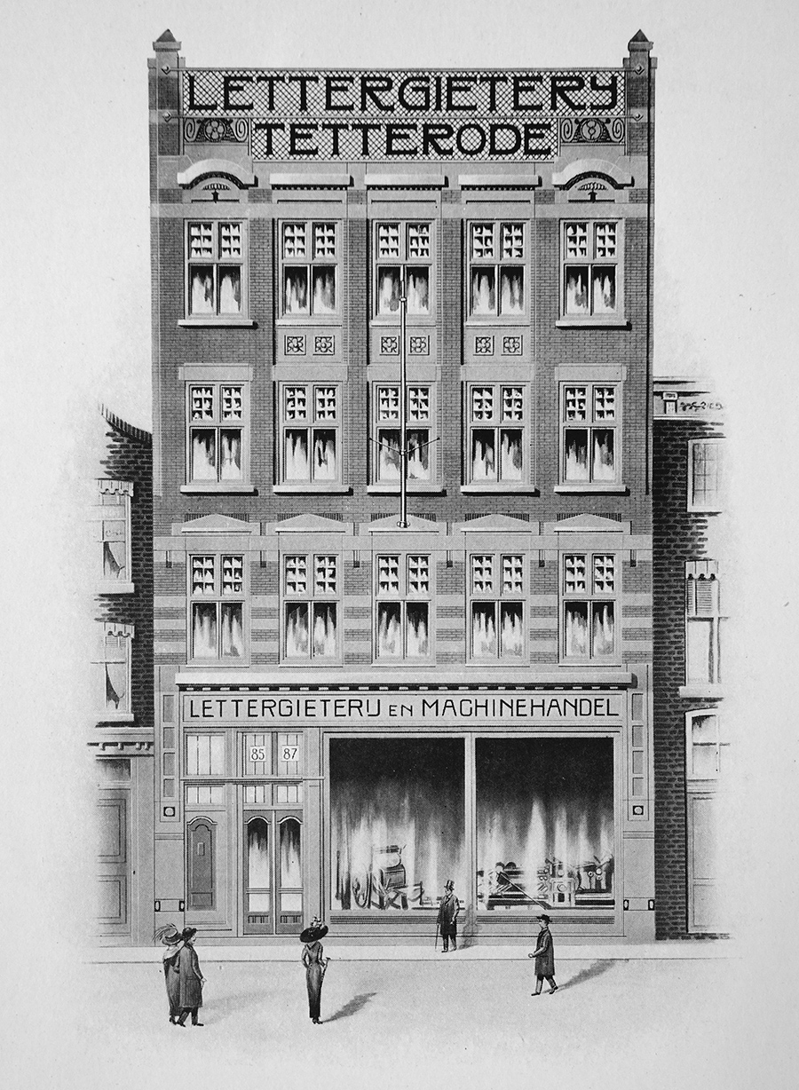
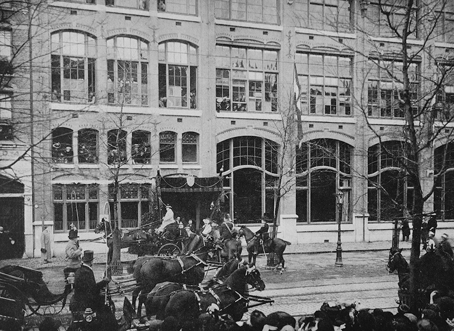
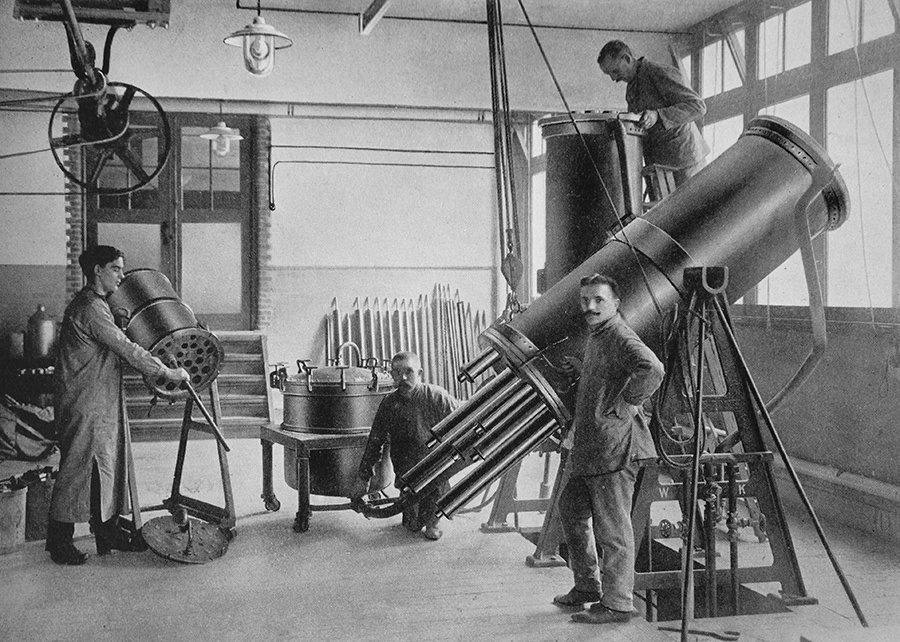
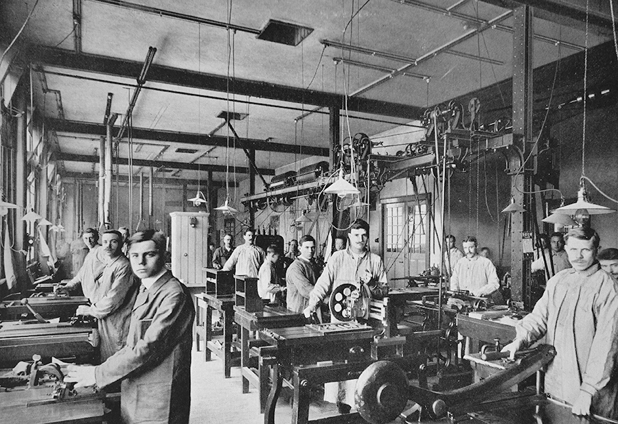
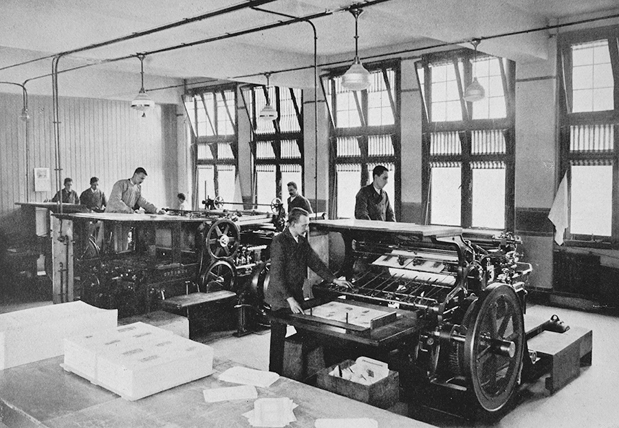
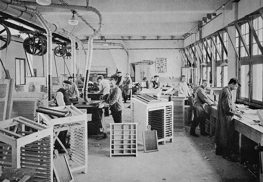
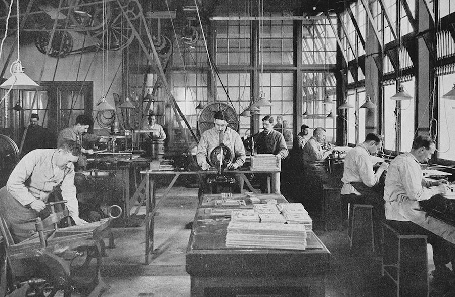
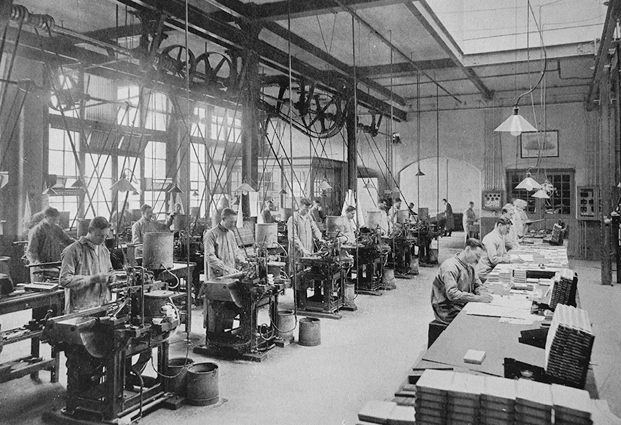
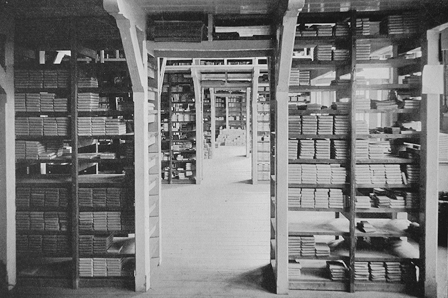
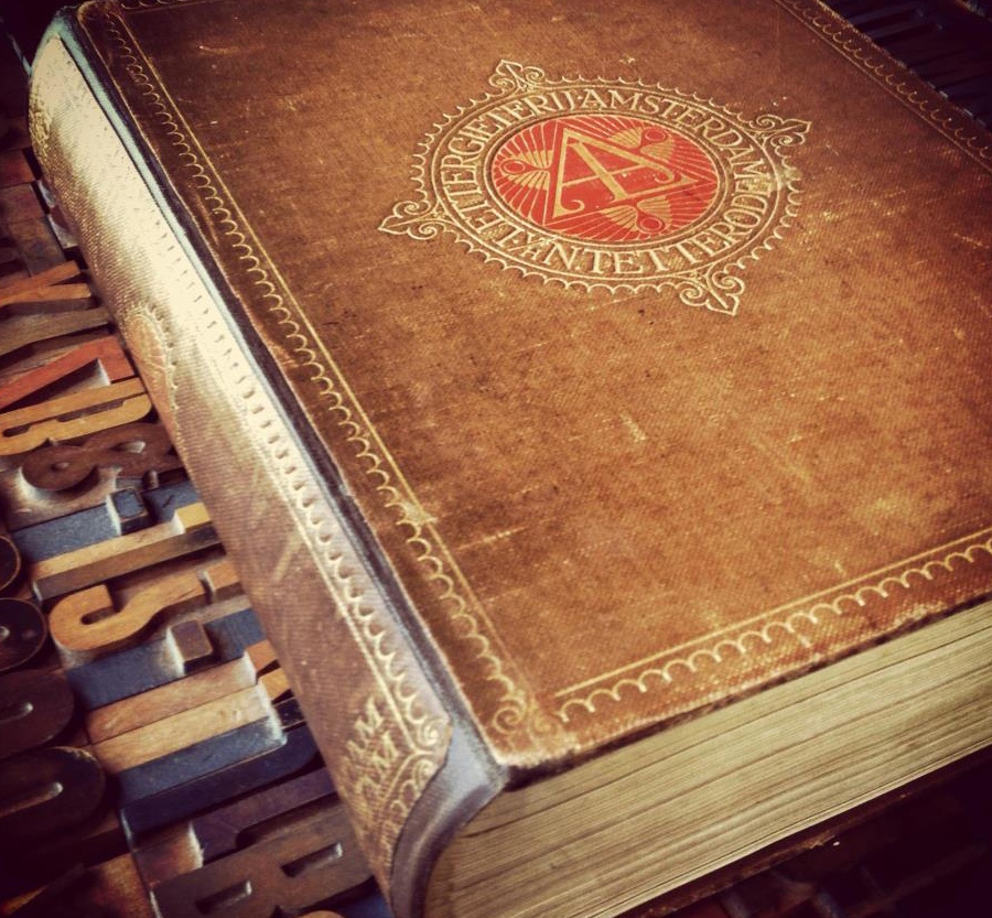
Pictures from the Lettergieterij Amsterdam Legibility Research: Type Design for Children with Low Vision Capital Sharp S designs. The good, the bad and the ugly. The above images are from the 1916 type specimen book “Letterproef der Lettergieterij Amsterdam, vorheen N. Tetterode” Tweet
Good stuff. Very high quality photos from such an old book.