Traffic Sign Typefaces: Tratex (Sweden)

The swedish typeface for traffic signs is called Tratex and was designed by Karl-Gustav Gustafson and modified by Chester Bernsten.
Tratex is available in 4 styles. The first one is called Svart (“Black”):
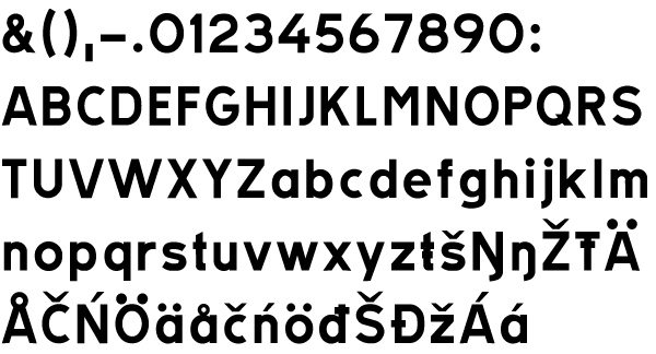
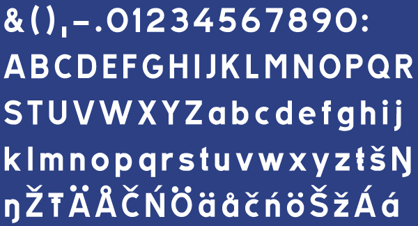
Vit (“White”). It has an increased spacing to compensate the overglow effect.
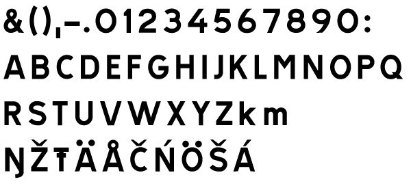
PosVersal (“Positive Caps”):
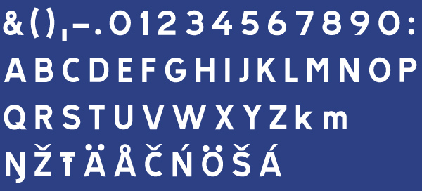
NegVersal (“Negavite Caps”). Identical to PosVersal, but with increased spacing:
Swedish signs are mostly set in all caps. This seems to be a common practice in all Scandinavian countries.
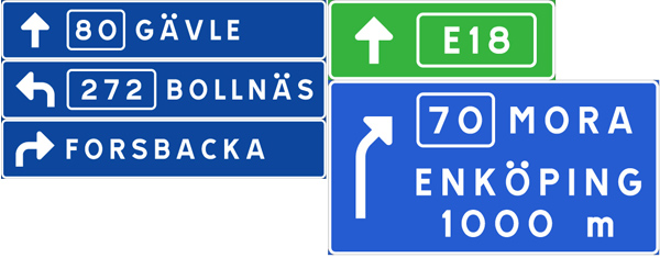
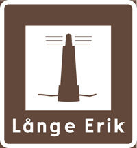
Signs with lowercase letters seemed to be reserved for local targets and tourist information signs.
You can download the Tratex fonts from the website of the Swedish Road Administration (MacOS X Diskimage here). The quality of those fonts is really bad. There is also a version from URW++, but they only offer one style.
Related Links:
- Other Blog entries about traffic typefaces
- Flickr group Type on Traffic Signs
BAd quality, and it’s not legible.
A shame!
I am often in Sweden and got used to Tratex, well I actually like the funny big Ä and Ö dots, and though from the typographic viewpoint it may be a badly designed typeface, but it’s got some friendliness in its imperfection - which I like. I noticed that in the Halland area along the E6 a lot of new roadsigns were put up using a “Transport”-style typeface. Does anyone know if they’re going to substitute Tratex? I hope not…