Designing the ultimate wayfinding typeface
Over the last couple of years I have researched the design and use of typefaces used for signage, especially road signage.
While road signs in general are scientifically researched for many decades in western countries, little is known about the parameters that lead to a maximum legibility of typefaces used in signage. And therefore the range of typefaces used on road signs is pretty wide. We see geometric typefaces…
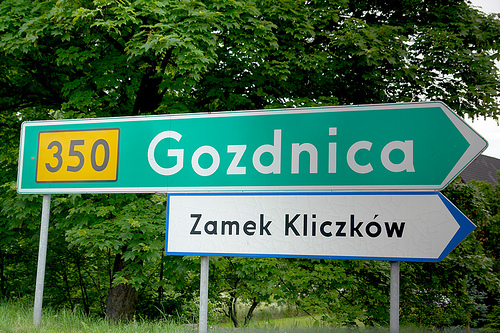
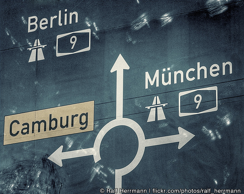
Road Sign Poland
…slanted serif typefaces…
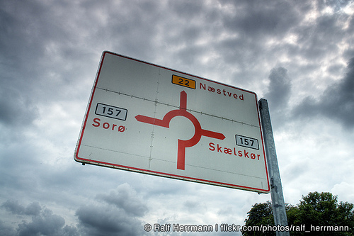
Road Sign Luxembourg
…and many old and modern sans-serif typefaces…
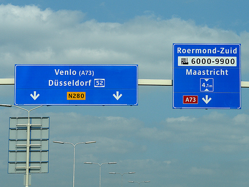
Netherlands (ANWB-Uu by Gerard Unger)
But which ones are most legible? Early road sign typefaces in the beginning of the 20st century were often designed by engineers with a strict geometric or grid-based approach. Newer designs, such as the new typeface in the Netherlands (see image above), are more based on the tradition of print typefaces. But in my opinion, both approaches have their drawbacks, because typefaces used for road signs have very unique requirements. Many people I have talked to seem to believe that speed might be the most important factor for the design of such typefaces, but that is actually not the case. The speed of motorists only influences the duration in which you can read the text on the signs. But that can simply be compensated by the size of the signs. What makes road signs so different from books and magazines is the variable reading distance. So if you want to improve the legibility of a typeface used for signage, the most important task would be to increase the viewing distance. If you are about to pass a huge motorway sign that is 50 meters away, legibility is no problem at all—the letters are so large, they could be set in Comic Sans and could still be read without any trouble. Where you can make a different thru type design is the moment when the motorist is at a distance where the text is just about to become readable.
A new approach
After traveling all over Europe for three years to experience and document as much road signage systems as possible, I started to design my own wayfinding typeface. This was part of my diploma at the Bauhaus University in Weimar, Germany. After all my practical and theoretical research it became clear to me that the regular way of designing a typeface on paper or on screen was not really appropriate. Because designing a typeface for a large viewing distance is not only a question of type design, it is also question of the feasibility of testing. To increase the viewing distance of my design I needed to experience my typeface in this blurry state where it is just about to become readable and I needed to test it when the visibility is decreased, for example by an overglow effect thru the headlights of a car.

That’s where I came up with the idea of my Legibility Tool Tool. It’s an OSX application that allows real-time simulation of different viewing conditions during the design stage. While I was working on the design of individual letters in FontLab, the tool showed me a simulated view of test words with the letters I was just working on. With this tool I could remove the guesswork and was able to optimize my design even for the worst reading conditions.
(Movie doesn’t work? Check it out at Vimeo…)
Often the simulations were quite surprising. Sometimes I was tempted to design my typeface in a way I was used to from the print world, but the tool clearly showed me that the reading conditions of road signs require a unique design for maximum legibility within this context.
About the design
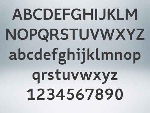
My wayfinding/signage typeface
So how does the ultimate signage typeface has to look like? When I evaluated existing signage typefaces with my Legibility Test Tool it became pretty obvious that all those stylistic details that define the overall look of these typeface disappear under difficult reading conditions. What matters most is the skeleton of the letters. On one hand these letter skeletons should be very generic, so they easily match the visual patterns we have learned and seen so many times in our life. But on the other hand, they also need to be somewhat unique. The most generic letter forms do not necessarily create the most legible letters, because too generic letter shapes are harder to differentiate. So in my design I used average proportions as a starting point but I also tried to stress the individual character of each letter.
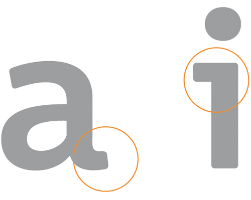
The “a” is a good example of this approach. The prominent stroke ending on the right may not be necessary to recognize it, but if it is there it helps to distinguish the “a” from other characters. Below is another example: Under difficult reading conditions, details such as the usually rather small crossbars of “f” and “t” get easily lost. Making these parts more prominent can significantly improve the legibility under difficult viewing conditions.

Top: German road sign font DIN 1451, Bottom: My wayfinding typeface
Certain letters can easily be mixed up under difficult viewing conditions. Designing those letters in a way where they are easily distinguishable makes the typeface more legible and increases the maximum viewing distance. Here are some examples…
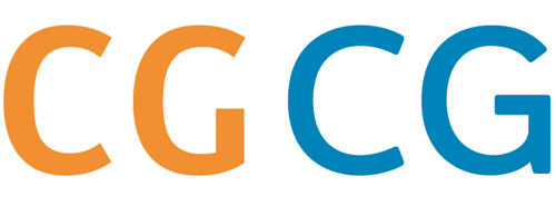
The missing horizontal crossbar of the Dutch road signage font (orange) makes C and G harder to distinguish. In blue are C and G in my typeface. The difference between the letters is easily recognizeable.
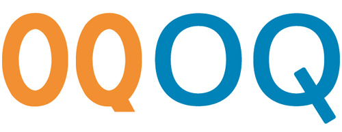
Poor differentiation of O and Q in the French road signage typeface (orange). On the right are O and Q in my typeface.
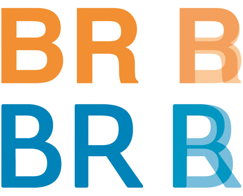
Helvetica (orange) has many letters that are designed very similar, which is not really helpful when used for signage. A more unique design helps to differenciate the letters.
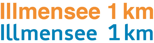
Another typical example: capital I, lowercase l and the figure 1 should better be designed in a rather unique way.
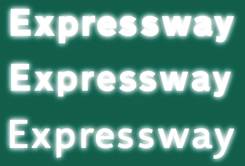
The stroke width is another important factor of a typeface used for signage. “The bigger the better” does’t work in this context—quite the opposite is true. Modern retroreflective sheeting of road signs create an overglow effect which affects the legibility. But this problem is not limited to road signs. Backlit signs in airports, hospitals and office buildings also suffer from this problem. The typeface design should compensate for this overglow effect. This can be achieved by using a thinner stroke width and by opening up the counters of the letters.
Top: Road signage typeface in Spain and Italy; Middle: Transport Bold (United Kingdom); Bottom: My wayfinding typeface
Figures are also crucial when a typeface is used for signage. In print typefaces the figures are mostly designed rather inconspicuously so they don’t stick out from the text. But figures in a signage typeface need to be very clear and easily distinguishable. The standard figures in my wayfinding typeface are tabular lining figures to accommodate the typical tabular use. But old-style figures (both proportional and tabular) are also available.
My wayfinding typeface also comes with a large set of arrows. They perfectly match the metrics and stroke withs of the typeface and can therefore be placed along with the text without any further corrections.
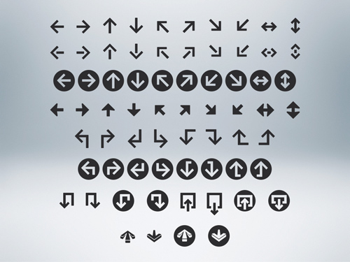
Moreover, the arrows can be used with some “OpenType magic“ built into the font. You can just type in certain letter combinations to automatically generate the arrows on the fly. (see demo below)
(Movie doesn’t work? Check it out at Vimeo…)
Positive and negative contrasts are often combined on one sign. Since light text on dark background always appears bolder, this can create an unwanted differentiation. A good signage typeface should compensate for this effect by offering different stroke weights to be used for positive and negative contrast.
Different stroke widths to be used for positive/negative contrast (only visible when the background is removed)
When I designed this typeface I usually had road sign in mind, but the typeface is not limited to this context. I can be used for all kinds of signage projects.
The typeface is not finished yet. I may extend the character set and add more styles. But designers working on wayfinding projects may contact me about a trial version of the typeface.
Update March, 2012: Wayfinding Sans Pro is now available at fonts.info and MyFonts.
Beautiful article Ralf, thank you for sharing your extensive findings and study on legible type. I’m curious about the tools that you use, especially the tool where you build a sign, is it a custom program?
What I like about your signage typeface is that it works really well using different stroke widths with different background colors in one sign (last example). Looking forward for real life examples using your typeface. Good luck!
Damn Ralf! This is really good work. I have some questions: Why did you decide to round the edges? Did that reduce flaring on retroreflective backgrounds, or maybe some other reason? What kind of solutions did you try out to counter the ‘closing’ of the counters in the a,e and g? Why did you not have a deeper connection from the stem of the n to the curve? Did you try out Meta/Officina Sans style instrokes?
I hope to see it on the roads!
As a newcomer to the subject of typography I would have to say that this is one of the most useful articles that I have come across for explaining practical problem solving with typography.
Thanks for the post.
Hi Ralf, it Iooks very good. It would be great to see this font system used on Czech road signs one day… Unfortunately, I am afraid the mixture of DIN, Helvetica, Arial and even Futura will remain on our roads and streets forever.
However, I could see one possible problem of using your font in countries with very long local names. The longest village name in the Czech Republic is “Nová Ves u Nového Města na Moravě” (this is rather an exception), but three-word names are quite common: “Bystřice pod Lopeníkem”. (It usualy means village xy under the hill xy or above the river xy.) I am afraid your condensed version is not condensed enough to accommodate long names on road signs… Do you plan a compressed version for those exceptions? I guess there must be similar problem in Germany as well: “Neuhausen auf den Fildern”…
Ralf, absolutely great work! Very impressed with the research you have put in, and you’ve got a great way of describing the process.
Would love to use this font in our next project!
Michel
Very thought provoking. it would be great to see more design going into signs, their legibility, viewing distance, target audience, lighting conditions to name a few. I will follow your progress with interest.
Sehr gut! Respekt!
Wow, great article. Really inspired by the extent and ingenuity in your researching. I like the typeface too!
Wow! Awesome work. I really like your thought process in this because it makes a lot of sense for speed and low-vision-friendliness.
Thanks! I just finished a 3700-mile working road trip and could have used signs designed this well, especially at rotaries.
Just Illustrator and InDesign. In the movie with the arrows I use some clever paragraph styles with nested character styles.
It’s a) a stylistic decision and b) makes the production of signs with adhesive foil easier and much faster
I pretty much just opened it as much as my test tool allowed me to (visually).
Again, the test tool proved otherwise. I startet with a much lower connection but it didn’t work.
Yes. Didn’t hurt but also didn’t help on larger viewing distances.
It’s setup as a Multiple Master font and the weights and widths are not set in stone yet. Need to figure out the best variants in real-world situations.
Interesting work, I wonder how useful it can be for ophthalmologists’ tests too.
Good work, Ralf. Nice to see how you’ve advanced the field with your testing app, and using OpenType substitution for arrows is cool, too.
Are you familiar with Clearview Highway?
http://www.clearviewhwy.com
Nice font btw.
Great work. Unfortunately, the two Flash movies don’t load at all
Which OS/browser/settings?
Anyone else having trouble seeing the Video movies?
Great presentation, Ralf! Many hours of work, I see
Chris
Amazing! Really good work. Such a nice article.
Wow, truly impressive. Congrats, Ralf!
Really nice work, Ralf.
Absolutely insightful article. I love the research and thought that went into this typeface. Can’t wait to see it in action!
Do you have a timeline on release?
I suggested using filters to simulate viewing in difficult driving conditions on the Typo-L list and was shot down for even making such a suggestion.
I don’t have the image I had originally posted but it was dome with a Photoshop action with about 30 steps.
https://listserv.heanet.ie/cgi-bin/wa?A2=ind0208&L=TYPO-L&D=0&P=8913
Thanks for this. I totally agree with the ‘blurred vision’ aproach to design wayshowing and been using PS filters myself to alter various signs (for font choices and letter spacing).
Good luck and looking forward for the complete family.
PS. I can’t see the movies on my phone QT perhaps?
Both the Vimeo videos fail to load for me too.
Mac OS X 10.6 & Safari 4.0.3, no non-std plugins.
When I click “play” the player goes black, just showing the controls.
Also, I loved your description of the process, and the font looks great.
Any idea what it will cost? Licensing?
The movies don’t start instantly after clicking Play. Give them some time to be loaded.
The direct link to them is here: http://www.vimeo.com/user2242271/videos
Waiting more than 2 minutes, still no video. And they play nicely when I go to Vimeo.com.
So, some weirdness with the embedding, and probably a Snow Leopard issue too.
Videos work fine for me running Snow Leopard in FF 3.5.
This post has taught me an insane amount about the production of a typeface, even after reading an innumerable amount of articles already. Thank you for sharing!
thank you very much for this research, like or not, it’s useful knowledge about useful Design.
Good luck
Ralf, again, your work is fantastic and like others I cannot wait to see your typeface in the real world!
The videos worked fine with Snow Leopard, NetNewsWire beta and also Camino 2.0pre4.
Thanks for sharing your knowledge. I learned a lot! I’m definitely bookmarking it to reference in the future.
Hello Ralf, great article on the lengths one needs to go in order to thoughtfully design a typeface made for legibility while moving past it at 60mph. I am currently working on a wayfinding project for the City of Pawtucket (State of RI), and would love to try a trial of the typeface.
Hi Ralf,
Thanks for a nice article.
I’m an amateur in type, and I have a question about the Erfurt picture. Looking at the left-hand side of this picture, where (I think) you simulated extreme reading conditions using your tool, I noticed that the horizontal strokes in the f and t cause ‘dark spots’ to appear where the horizontal storke crosses the vertical stroke. I don’t know if this compromises legibility, but it reminded me of the ink traps in Matthew Carter’s Bell Centennial typeface that were employed to solve a similar problem, if it’s any problem at all.
Personally, I think ink traps could help our brains decipher (at at maybe just a slightly greater reading distance) that we’re looking at two strokes or bars crossing.
What do you think? Did you try this? Would it do any good?
Jurriaan
@Jurriaan:
You don’t want such dark spots on a close distance (therefore ink traps are used or most often: strokes are thinned out on connection points), but for this simulation of a large viewing distance this dark spot is what makes the f visibible as such. So it’s not a bug, it’s a feature.
Nice article about process and thought behind font design process. Most of people do not think this much about font.
thanks for sharing
Outstanding typeface work, excellent article! It should be used by design schools as example of research and methodology. Congratulations Ralf, I really hope to see your type on the roads and airports.
It seems like this font may also be useful when giving presentations. I’m a research scientist, and frequently the slides people show at conferences are nearly illegible. I know that better slide layouts would probably solve the problem, but I wonder if using a font like this would help too. Anyway, great work!
I work for a company that does an extensive amount of work with projects where a font like this would be very useful. Not to mention a good alternative to some of the typefaces we currently use.
I am interested in the trial version of this font and quite possibly the finished version, keep me up to date as to when this will be available.
And as everyone else has already said really great work!
That’s a very good article. Thanks for sharing yout thoughts!
This article is so great. It’s amazing. All of the designers must read this, mainly de Brazilian;s designers.
Congratz Hermann
regards
Daniel Campos
PS: i’ll contact you in Twitter ok (i’m @logobr)
Very nice work, mate. Well written and illustrated. Your wayfinding typeface demonstrates that a good road signage alphabet can be both attractive and practical. (While Clearview may hold up well in stress testing, I would guess I’m not alone in considering it pretty ugly. That it’s finding adoption by some governments at the moment shows how vacuous this font category is right now.)
One comment regarding your illustration as interior airport signage: stress factors are reduced because indoor lighting is much better controlled and readers have more time to consider messages. My own feeling is that such interior wayfinding systems can weigh aesthetic considerations more than street signage, with “big” variations of alphabets: finer details and a greater emphasis on stylistic devices that give venue designers a font family that’s also a terrific branding tool.
I look forward to seeing your very smart typeface out there soon!
This is great work Ralf,
It’s particularly fascinating for me as I have been working on researching related subject matter, but more specific to the problems encountered in my own country, Ireland, with our dual-language signs.
What I delight in seeing here, is that designers working on similar problems can find very different solutions!
Also, I love the idea of your legibility tool. If I could only have back the lost hours I’ve spent on simulated halation testing! Very impressive Ralf, I look forward to seeing it in application.
Best
Garrett
Let me just object to the word “ultimate.”
Hi Ralf,
I’m a design student working on a wayfinding project for school. Would I be able to get a trial version of your wayfinding typeface to use for this?
Excellent article!
Fancy meeting you here ralf.. well not really- magnificant- i love it- thats the way to do it and to show it to the typokids (anywhere) i allready posted the url to one of my students, i try to push to embark on a new german autobahn typeface..
again, type made my day. keep it up, you fontfreaks!
.
I am shocked that after reading this blog that noone has mentioned the obvious. All of this “research” shown in this article has been the subject of research and design review for the last 50 years by a number of different universities. Ok those universities are mostly in the US, but that means they exist. All of this research has been done under peer review and has been published many many times.
If you would like some perspective on just how extensive this work has been just go to http://www.segd.org or http://www.ussc.org. There has been formal research on typeface going back 20 years, arrows, placement etc. This all goes back to the early 1950′s with research in Transport typeface. The legibility tool developed above was also used by Penn State many many years. ago.
And even more halation research goes back at least 15 years with the landmark studies by the Pennsylvanis State University and Donald Meeker for the clearview typeface. Just a quick googling can yield this work.
And clearview is not the only typeface that has been reviewed. Futura, rawlinson, franklin gothic have all been research. Heck I used research on futura for a sign progam in 2002.
I know that this person knows all this reseach exists. This blog makes it look like this was all invented by this one person. Literature review abd bibliographies are important on blogs as much as printed reports.
There are a number of typeface designers out there who submit their work to this review. If this designer would like to do the same I would suggest they contact the Pennsylvania State University, Texas A+M, Kent State about submitting for third party testing. If not all their work will not be worth much.
@ Craig:
First of all: feel free to call me by my name and not “this person” – it’s not really polite.
I don’t really understand your anger about this post: It is by no means a scientific paper – I am a type designer who describes his design approach for this specific typeface – no more, no less.
No, I don’t have invented the idea to test halation/legibility/…, but as I clearly pointed out, there was no way for me as type-designer to include such a test in real-time(!) in my design workflow. That’s what I have done – no more, no less.
Again: I am a designer and this typeface is the result of my design research and design work – it is in no way based on any scientific papers or studies, so there is nothing to link or credit here.
I am well aware that such a design approach may bring different results than a scientitic approach, but that doesn’t necessarily mean, that my approach is wrong, just because it has no blessing from one of these universities. But I would be happy to get in contact will all of them to share our findings. I’m sure there is a lot to learn on both sides.
It is not that your process is wrong, or incorrect, or even un-interesting that is the issue. The issue is that there is a context for the work that people do. People who respond to this blog often have no idea about legibility issues and your writings refer abstractly that there is a body of knowledge to this, but also make a whopper of a statement. That there is little written on the metrics of what makes a typeface more legible. This is just flat out wrong. When I was a student back in the early 90′s they were in the midst of developing metrics trhough extensive research. In fact a whole section on this topic was published in the New York Times five years ago!
Also it is well understood that in Europe and North America typefaces used in a roadway environment today are held up to considerable scrutiny, not just accepted directly. A little bit of discussion on that would be a good thing.
There is no need to submit your ideas to any formal testing, and designers should be encouraged to experiment the way you have done. In fact most typefaces will never be tested and that is fine. But it would be nice to refer to at least some of the precedents and work from there. I know that as someone who has been around legibility research for a number of years, you always need to reeducate people, but that is why we have these forums.
I was referred to this blog posting by a designer so these things get around. I know I may be a little tough on you, but that is becasue your design ideas are strong. I would not want you to take your work (Which I actually think is pretty good) in front of a groups of peers and be wrecked by a person with a little knowledge. Better to get thrashed on the web.
hello Ralf again. typographers are short-circuited - even in america- sometimes. well, it’s human! i liked your response ralf-.
is there a german version of your wayfinding article and where do i find it -
and to graig -first- i do not agree with most of your arguments and second- i tried both reference sites: the first didnt appeal and the ussc wants money for evry article or and membership. thats ok- but than the information about all that us research is not really availible/unless you buy it - like i would share it with my type/corporate design students in cologne, for instance. and dont forget: yes we can (if we stay togerther…)
keep on typing though- i love it.
is there a german version of your wayfinding article and where do i find it
Not yet, but I plan to make wayfinding the next topic for our TypoJournal, so it might end up there.
Ralf,
Great article and really clear very nicely designed typeface. I have a project coming up in the new year to redo all of the signage for our University Library and this font could be perfect for the job.
I would love to hear from you as to when you plan to have the font for sale, or if there is a chance to have a test version to convince the powers that be to give me the money to buy it eventually.
Simon
Hello Ralf,
wonderful article.
Reading along, something occurred to me:
Dutch license plates have this weird ‘missing parts’ in the characters: http://sunpig.com/martin/archives/2003/09/20/dutch-car-license-plates-and-traffic-control.html
Can you find out with your Legibility Tool whether this actually helps to improve legibility from far away?
Onno
Those “missing parts” certainly decrease the legibility, but that’s not the point. It’s more important that no one can can just paint an R out of a P with a black pen. So these features do make sense.
Hello Ralf,
Nice article! I’m a student yet,so I didn’t know how many tests,and things you need to do for creating a typefont,especially if it’s for wayfinding. I just thought that was like ‘bigger,better’! hehe
You said in the ending of the article to contact you to receive a trial version of the font,if you can send it to me, I would enjoy!;~)
OCR-B was also designed (by Frutiger) using some interesting objective criteria: http://www.telegraphics.com.au/doc/scarrott_ocrb.pdf
Did you look at the research of Jock Kinnear and Margaret Calvert: http://designmuseum.org/design/jock-kinneir-margaret-calvert
Really great post. Thanks! Made me wonder why the size of fonts isn’t variable on signs, according to distance.
Great Job, Ralph!
I´m art director in Brazil, and your article is excellent.
Regards,
Vinicius
Great artice Ralf and even better tyoeface, I never knew so much attention went into signage typefaces, but now I can see why it is so invaluable. Thanks for the interesting read.
Just came across this site very interesting site and post Ralf – I have covered a lot of the issues myself during large wayfinding scheme I was involved in. I would be interested in getting my hands on the trial version of the typeface when available.
Great discussion. I too would like to see empirical data to support the effectiveness of this design. Without a background in the sciences it’s not quite fair to expect practicing typographers to be able to design and conduct them, let alone publish them.
Designing studies to support or refute design is actually quite simple. The hard part are the pragmatics; finding a research scientist who is willing to collaborate, writing grant proposals for funding, access to technology such as eye-tracking equipment, finding someone to help you build the materials be they signs or simulations, finding someone to help you with the data analysis, finding an editor to help you write the manuscript and my personal favorite, getting ethical approval to conduct the study approval as you will be using human subjects.
If you can jump through all these hoops, then your work has a chance of getting published in a peer-reviewed journal. This is an enormous undertaking and would probably take ~three years before publication depending on how thorough your study is and who publishes it. I have no idea how much it would cost but I’d hazard >one million at least.
Experimental design is actually quite fun, and for any designer who favours a structured approach to problem solving, you will probably find yourself naturally drawn to scientific method. In this case an observation has already been made. Next we need to ask some directed research questions such as “Is this typeface better than Clearview Highway?”
Following this, we need to define what we mean by “better.” Better = Can someone discriminate words faster in low light?
Better = Can someone spot a word set in this typeface as opposed to that one?
Better = Can comprehend language in this typeface with greater accuracy compared to others?
Next, define the independent(IV) and dependent(DV) variables (the ones you change and the ones you measure).
Potential IV’s:
Typeface
Size
Lighting
Colour
Speed of vehicle
Potential DV’s:
Crashes (obviously in a simulation)
Eye movements
Detection
Comprehension
Reaction time
Search time
Next, make a testable hypothesis. A simple example would be “IF I change the typeface from, THEN I expect reaction time to decrease (measured by subjects ability to read key-words while speeding down the highway).”
Now you’re ready to design your experiment. For example, put someone in a car, place them on the track, ask them to spot a target word, change the font, repeat.
With an experiment designed you’ll be in a position to build your materials be they billboards or video games.
Following this, you’ll have to go through the process of statistical data analysis (I still need help with my math homework).
The comes the writing. And editing. And writing. And editing… This will take several rounds before it’s ready for submission, and once accepted, there will be several more rounds of editorial depending on the journal.
This type of study would make a wonderful contribution to the typographic community as it would give practicing typographers an awareness of a new (to them) method of problem solving and more important;y, provide data to support or refute the decisions and conclusions we traditionally make by intuition.
I would be more than willing to participate in a study like this.
——
The video does not work on my browser either: Firefox 3.5.8, OSX 10.6.2
I cannot find an example of the Legibility Test Tool
How do I upload an avatar?
Thanks for the great article. Great work. I would really love to experiment with your beta-typeface when it comes to signmaking next time. I would appreciate an email.
Greetings from Frankfurt. den sen
I am working on a wayfindng system for Dublin city. I’d love to experiment with this typeface, however, are there accents? áéíóú & ÁÉÍÓÚ ?
Very nice work, and great article.
Hi Ralf,
Really enjoyed reading the article and the way you approached the typeface. I’m going to a typography workshop in the next couple of weeks and would love to experiment with your trial typeface before this.
Thanks ever so much,
Tom
Hi Ralf,
nice stuff. I am also interested in the tool you seem to use in the second video. What is that? I am in desperate need for a way to automate sign layout design..!
Cheers
Gio
It’s a little tool called Adobe InDesign.
Hello Ralf. Very pleased to find your site. ive just sent you an email with some enquiries. Hope to have news from you soon
L.
Hi Ralf,
I suppose you have heard about David Kindersley, whose approach to find a much more readable — and of course well-designed — font for the British roads was startlingly almost the same. Sadly he didn’t persuaded the Ministry of Transport, and AFAIK his MoT Serif remained in developing status. Since I really like Kindersley’s works and habit, this article (and most probably your diplom work) was a true diamond for me. Thank you, congrats.
About DK:
“In 1952 he submitted a design, MoT Serif, to the British Ministry of Transport, who required new lettering to use on United Kingdom road signs. Although the Road Research Laboratory found Kindersley’s design more legible, the all-capitals design with serifs was passed over in favour of that of Jock Kinneir and Margaret Calvert.”
http://en.wikipedia.org/wiki/David_Kindersley
Great article. Would love to experiment with the trial version of the typeface. Please do let me know if that’s possible.
I just finished some preliminary layouts for a billboard, and after scanning through all of the hundreds of fonts on my computer, I selected Trebuchet as the most readable for such a use. Now, looking through your article, I see why, it has many characteristics similar to your font. And I’m pleased to see that my layouts survive the blur test quite well.
Did you do any investigations into the legibility of italics and condensed versions, and are you going to offer them as well?
As has been said many times…well done!
Great Post Herr Ralf Herrmann !
What are you thoughts on Clearview or the Flaminia Type System?
There was also a project called Euroface that took a similar testing approach.
The Euroface typeface is a joke! And I mean that literally. Everything in this linked text is made up. There is no such typeface that gets more legible with increased speed.
It’s amazing how many people fall for this joke. I even saw it in scientific literature.
Ralf,
Yes, it’s obviously a spoof. You didn’t find it amusing? Come on… “A team of Russian typographers in the Arctic Circle…”
-Toby
:O
I just remembered the article and set out to find the URL, didn’t actually re-read it.. hehe. Nice prank, you’ve got to admit.
But the question about Clearview and Flaminia remains, those are real I’m impressed by the legibility of Clearview, would be interesting to see how it stands against your creation (does it have a name yet?)
The European TERN-font is really a joke. Althought I think Wayfinding is surely better legible than Tiresias Signfont or Transport, I still like DIN and Highway Gothic (in my country: RWS-Ee, RWS-Dd and RWS-Cc) most.
A very informative article. This helps me a lot for my campus project. Thank you so much!
To put it simple: you actually created the most readable font style i ever witnissed. Now try and get it standardized as an European Norm! Send the International Road Federation (irfnet.org - “Better roads, better world”) a nice set of high-quality example printouts! Don’t stop at this excellent blog post! You can do it Ralf
This typeface would perform excellent for signage in Mexico, where we suffer a mixture of Interstate and Arial (the latter being more common as the time passes).
Amazing! Very nice how you designed it and those little changes but that make a big difference in legibility! Beautiful!
Ralf — are you still planning on making this available? I see that this was posted nearly 2 1/2 years ago — I was interested in trying the font in some presentations to see if it helped with legibility for those who don’t sit as close to the screen.
Sure, it’s work in progress.
It’s not a screen font though. There are some similarities in terms of legibility, but making a screen font out of it, would be an entirely different project.
Ralf — Could you summarize in a sentence or two what the differences would be (as I’d like to understand)?
My considerations:
Large font at a distance.
People with varying eyesight.
Maximizing readability.
A font without “distractions” or flair to take away from the content.
I don’t put too many words on a slide, but when I do, I like them to be readable.
I’m doing a presentation today for more than 200 people and had been hunting around for something “different.” (Although, it’s much too late for me to be switching fonts, etc. now anyway — but I’d read through your excellent post with great interest).
Your work is important and impressive. I would like to see comparison data or font with Terminal Design’s “Clearview Hwy” font adopted for use on road signs in the USA.
Clearview HWY and Wayfinding Sans are or will be both good choices for many signage projects. I don’t necessarily need to find out if one should perform slightly better in certain situations. Especially since the choice of typeface is just one of many many variables that make a good wayfinding system.
An obvious difference is the rather extreme x-height of Clearview HWY, which works fine for the US signs it was made. In contrast, Wayfinding Sans has very prominent diacritical marks which are important for signage in many countries outside of the US.
Hi Ralf
Smashing project. I wondered, do you have plans to include a set of pictograms to accompany the typeface?
Yes, there will be an additional set of pictograms:
http://opentype.info/blog/2011/04/13/wayfinding-symbols-with-opentype-magic/
Really enjoyed seeing the process behind the font. I was just about to buy one or two weights when I came across this. Thanks
This looks like a good typeface, and the development is certainly interesting.
However, the halation example with ‘Transport Bold’ is not really fair. As you are no doubt aware, the typeface face comes in two weights, actually called Transport Heavy and Transport Medium. Heavy is for use in black on a light background, whilst Medium is for use reversed out, to compensate for the effect of halation. In the example above, it would have been fairer to compare your typeface with Transport Medium.
That image should just demonstrate the effect in general and therefore I chose 3 type styles with 3 different stroke widths.
How do you mean?
“It’s not a screen font though. There are some similarities in terms of legibility, but making a screen font out of it, would be an entirely different project.”
The typeface is on FontDeck, MyFonts, and Typekit for webfont embeds. I don’t understand.
Sure you can use it on the web. It’s just not specifically made for this kind of use. (Like many other fonts which are used on the web)
It’s gorgeous. I’d love to use it as a text face. I realize it’s primarily for display and signage though. What is your recommendation? I noticed you aren’t using it here, but that could be boring as a designer because it’s too familiar.
It’s made for all kinds of »display use«, where short pieces of information are presented. That can be a highway sign or a web headline. Here is an example of someone using it on the web:
https://www.facebook.com/photo.php?fbid=385039354908416&set=a.314573071955045.75246.114731268605894&type=1&theater
For copy texts, there are many typefaces more suited for this kind of use.